Finishing touches get scheduled last and budgeted least — and it shows in a lot of otherwise well-executed renovations. The structural work, the layout, the cabinetry can all be right, and a renovation can still feel unfinished if the paint, decoration, and final detailing are treated as an afterthought squeezed into the last week of the project.
Paint and interior finishing aren’t decoration bolted on at the end. Done properly, they’re a core part of how a renovated space actually reads once it’s lived in. Here’s how to get it right.
Why Finishing Touches Get Underestimated
Most renovation budgets and timelines are built around the visible, structural milestones — demolition, plumbing, electrics, cabinetry, flooring. Painting and finishing tend to appear as a single line item near the bottom of the schedule, treated as a quick job that happens once “the real work” is done.
In practice, a proper finishing pass — colour consultation, surface preparation, multiple coats done correctly, and the small detailing work (skirting, architrave, hardware finishes) — takes real time and real skill. Rushing it is one of the most common reasons a renovation with a strong structural budget still ends up looking unfinished in photos.
Choosing a Colour Palette That Works With the Architecture
The single biggest colour mistake in renovated homes is choosing paint colours in isolation from the architecture and existing material choices, rather than as part of the same decision.
A few principles that hold up consistently:
- Let the fixed elements lead. Stone, tile, and cabinetry choices are expensive and hard to change later. Paint colour should respond to those choices, not compete with them.
- Test in the actual room, at different times of day. London light shifts significantly between a north-facing and south-facing room, and a colour that reads warm in a showroom can read cold and flat in a room with limited natural light.
- Limit the palette across connected spaces. In open-plan or flow-through layouts — hallway into kitchen, kitchen into garden — a tightly controlled palette across the connected rooms reads as considered. A different colour in every room reads as unplanned.
Matte vs. Eggshell vs. Gloss — It Matters More Than the Colour Itself
Finish (sheen level) affects how a colour reads almost as much as the colour choice itself, and it’s frequently an afterthought.
- Matte finishes hide surface imperfections well and give a soft, contemporary look — ideal for period properties with older, slightly uneven walls.
- Eggshell offers a subtle sheen with better durability, a strong choice for hallways and high-traffic areas where matte would mark more easily.
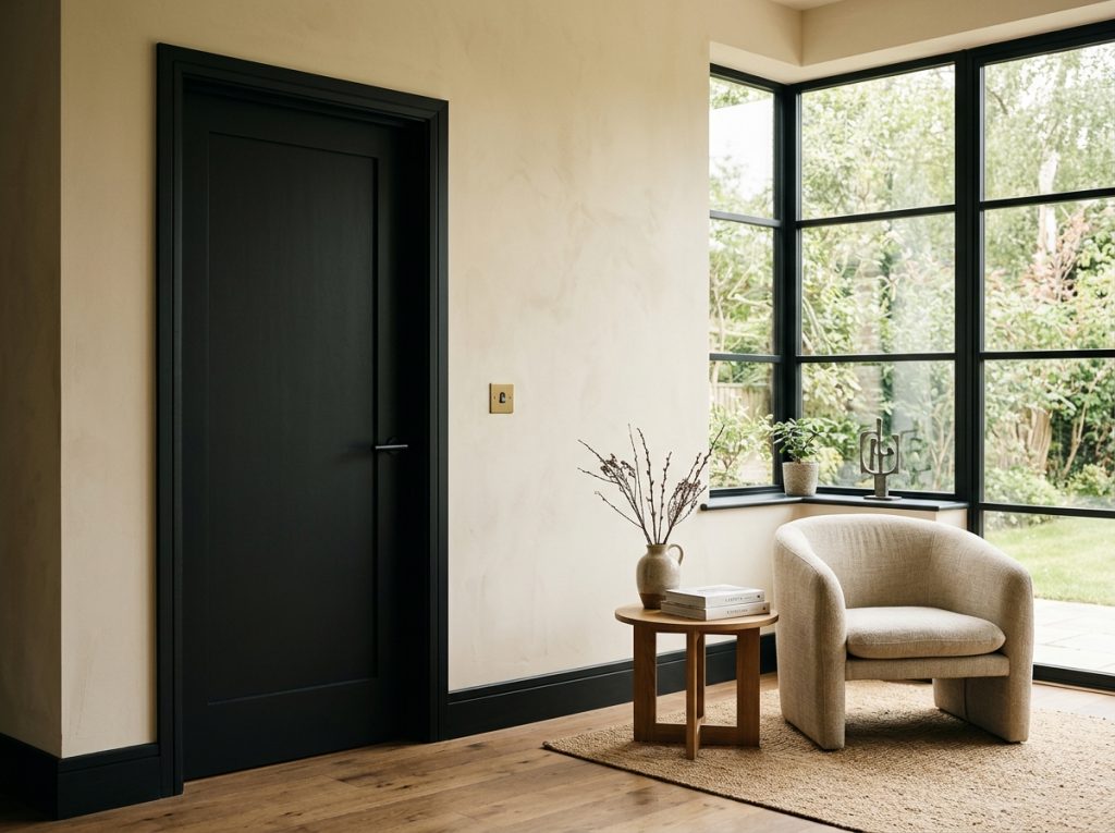
- Gloss and satin finishes on woodwork (skirting, doors, architrave) create contrast against matte walls and read as considered rather than accidental — a detail worth specifying deliberately rather than defaulting to whatever the trade used last.
The Detailing That Separates a Finished Room From an Unfinished One
A handful of small decisions consistently separate renovations that feel genuinely complete from ones that feel slightly unresolved, regardless of how much was spent on the bigger-ticket items:
- Consistent hardware finish across a room — door handles, light switches, radiator valves — in the same metal tone (matte black, antique brass, or brushed nickel, matched throughout)
- Skirting and architrave painted crisply, without visible brush marks or missed corners, which is one of the most noticeable tells of a rushed finishing pass
- Wall-to-ceiling transitions cut cleanly, particularly where a feature colour or wallpaper meets a painted ceiling
- Light switch and socket positioning considered at the design stage, not just wherever existing wiring made it easiest
Working Colour and Texture Into a Renovation That’s Already Underway
If structural work and layout decisions are already locked in, colour and finishing choices still have real room to shape how the finished space feels:
- Use texture, not just colour, to add depth in a room with a restrained palette — a textured plaster finish, a natural fibre rug, or a wood tone that contrasts with painted surfaces
- Introduce one considered accent material rather than several competing ones — a single feature wall in a natural material (limewash, panelling, or a bold but well-chosen colour) reads as intentional in a way that multiple smaller accents rarely do
- Match new work to existing period details where a renovation is partial rather than whole-house — cornicing, ceiling roses, and skirting profiles should be replicated or matched, not ignored in favour of whatever’s fastest to install
A Simple Planning Checklist
- Has the colour palette been chosen in response to fixed materials (stone, tile, cabinetry), or independently of them?
- Has each colour been tested in the actual room, in real light, rather than judged from a swatch or a screen?
- Is there a considered finish (matte, eggshell, gloss) plan for walls and woodwork, or has that been left to whoever’s painting?
- Is hardware finish consistent across each connected space?
- Has enough time been allowed in the schedule for proper preparation and multiple coats, rather than a rushed final-week pass?
Finishing Touches Are Where a Renovation Either Lands or Doesn’t
The structural and layout decisions in a renovation are what make a space function. The finishing decisions — colour, texture, sheen, and detail — are what make it feel resolved once it’s actually lived in. Treating that stage with the same care as the earlier, more visible parts of a renovation is consistently what separates a good result from a genuinely finished one.
At Alborz Groups, interior painting, decoration, and finishing touches are designed and executed to the same standard as the rest of the house — never treated as an afterthought. If you’re planning a renovation and want the finishing details handled properly from the start, get in touch.