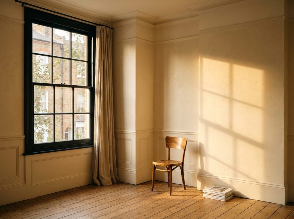
Most people choose paint colour by looking at a small swatch under shop lighting, then are surprised when it looks different on the wall. That is not a mistake in the paint. Colour is the result of the paint and the light falling on it, and the light in a London home changes from room to room, hour to hour and season to season.
Choosing with the light in mind is the single easiest way to avoid repainting a room.
1. Know Which Way Each Room Faces
Aspect shapes the light more than anything else:
- North-facing rooms get cool, soft, indirect light with a slightly blue-grey cast. Colours that look warm elsewhere can turn flat or muddy.
- South-facing rooms get warm, bright light for much of the day, which can make colours look warmer and stronger and can tolerate cooler tones.
- East-facing rooms are bright and warm in the morning, then cooler and dimmer later.
- West-facing rooms are dim earlier in the day and glow warm in the evening.
Walk through your home at different times and note how each room feels. A room you use mainly in the evening should be judged by its evening light, not its midday light.
2. Use Light Reflectance Value (LRV) as a Guide
Every paint colour has a Light Reflectance Value, a number from 0 (pure black, absorbs almost all light) to 100 (pure white, reflects almost all light). It tells you how much light a colour bounces back into the room, which matters most in rooms that do not get much.
As a rough guide:
- Below about 40: dark colours, such as deep navy and charcoal. They suit dramatic, snug rooms and accent walls.
- About 40 to 60: mid tones that work in many living spaces.
- About 60 to 85: light shades that still show colour. Good for walls where you want brightness.
- Above about 85: whites and very pale off-whites, often used on ceilings and trim. In low light they can look stark.
For a room with little natural light, choose a higher LRV, with many guides suggesting walls above roughly 60 and higher still for the darkest spaces. These are guides, not rules, and different sources give slightly different numbers. The LRV is usually printed on the manufacturer’s colour chart or website, so check the actual figure for the colour you like.
3. Warm Up North-Facing Rooms
Because north light is cool and bluish, the colours that tend to work best have a warm undertone to balance it:
- Warm whites and creams with a touch of yellow, pink or peach in them
- Warm beiges and soft greiges with a visible warm base
- Soft yellows and golds, which counter the grey cast most effectively
- Warm pinks and blush tones, whose undertone offsets the blue light
Colours that often disappoint in a north-facing room include cool greys, stark pure whites, and cool blues and greens, which can amplify the blue cast and make the room feel colder. If you want grey, choose one with strong warm undertones.
That does not mean a north-facing room must be pale. A deep colour can work beautifully there if you commit to it fully and light the room well, but it will read as moody, not bright, so make that choice deliberately.
4. Understand Undertones
Two colours that both look like “greige” can behave very differently. Undertone is the hidden hue under the main colour: a grey can lean green, blue, pink or purple, and a white can lean yellow, pink or blue. Undertones are easy to miss on a small swatch and obvious on a full wall.
A simple check is to hold the swatch against something pure white, such as a sheet of paper. The undertone usually shows up against the contrast. Then see how it sits against the fixed things in the room: flooring, worktops, tiles and curtains.
5. Test Properly, in the Room
This is the step that saves the most money. Do it like this:
- Use large samples. Paint a sample at least around 60cm by 60cm, or paint it onto a lining paper board you can move around. A small patch next to the old colour is misleading.
- Test on more than one wall. Light changes from wall to wall, and a colour will look different in a corner than on a wall facing a window.
- Look at several times of day. Check mid-morning, midday, late afternoon and evening under artificial light. Late afternoon is often the dimmest time.
- Look with the lights on and off. Most people see their rooms in the evening.
- Live with it for a few days before you decide.
6. Don’t Forget the Light Bulbs
Bulb colour changes how paint looks. Warm bulbs make warm colours richer and can make cool ones look duller. Cooler, whiter LEDs make light colours look brighter and crisper. Use the same type of bulb in a room that you plan to use when it is finished, and test samples under it. Floor and table lamps help lift dark corners and give a more even spread of light than a single ceiling fitting.
7. Think About the Rooms Together
Colours should work as a sequence as you move through the house, particularly where rooms open onto each other. A hallway, a living room and a kitchen seen in a single sightline benefit from a related palette. You do not need the same colour everywhere, but the undertones should agree. A mix of warm and cool undertones in connected rooms often looks accidental.
8. Match the Sheen to the Light
Sheen affects how much light a surface reflects, as well as how durable it is. Very matt finishes absorb a little more light and hide wall imperfections. Slightly more reflective finishes bounce more light around. In a dim room, a finish with a little sheen can help, but it also shows flaws more, so the wall preparation matters.
A Short Checklist
- Which way does each room face, and when do you use it most?
- What is the LRV of the colours you are considering, and is it suitable for the amount of light the room gets?
- Does the undertone suit the room’s light and the fixed finishes in it?
- Have you tested large samples, on several walls, at several times of day and under your actual bulbs?
- Do the undertones agree across rooms that connect?
Colour Is a Conversation With the Room
The best paint choice is rarely the one that looks best in a catalogue. It is the one that suits the room’s light, the materials already in it and the way the household uses it. A few days of careful testing costs very little compared with repainting.
At Alborz Groups, interior painting, decoration and finishing touches are designed and executed to the same standard as the rest of the house, with colour chosen for the room it is going in. If you want help getting the finish right, get in touch for an initial consultation.